
Video/Installation Work 2006
New York Times Data Mapping Piece
The New York Times Data Mapping Project is a soft sculpture visual representation of New York Times headlines for the month of January, 2006.
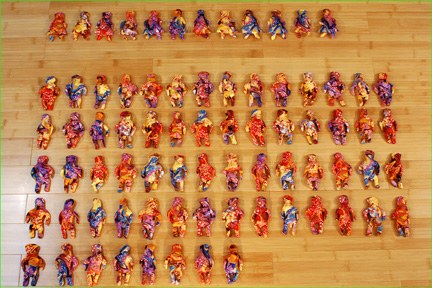
Each category of headline, such as "International," "NY/Region," or "Technology" is represented by a palm-sized stuffed bean bag doll made from a different pattern of fabric. Figures are also differentiated by gender, as expressed by the names of headline article journalists.
The final data tally showed that about 22% of headline authors were female, and this tally would have been lower if there had not been a spike of articles written by women for the few days around the confirmation of conservative Judge Samuel Alito to the Supreme Court. The final data set may also reveal something about what topics are most important to readers of the New York Times currently. For example, a comparison of the number of Technology headlines in the New York Times relative to the number in the San Jose Mercury News might potentially yield relevent information about audience demographics.
This piece is interactive in that I encourage people installing it to experiment and push for as many patterns for representing the data as possible. Here I show two simple possibilities for arrangement, a floor grid and a floor pie graph.
The image above shows the dolls representing headlines about international news. That month there were 12 articles in that category written by female journalists and 64 authored by men.
Please see http://www.pelefire.com/nytimes/index.htm for detailed images and documentation.